A tool to configure the best PC
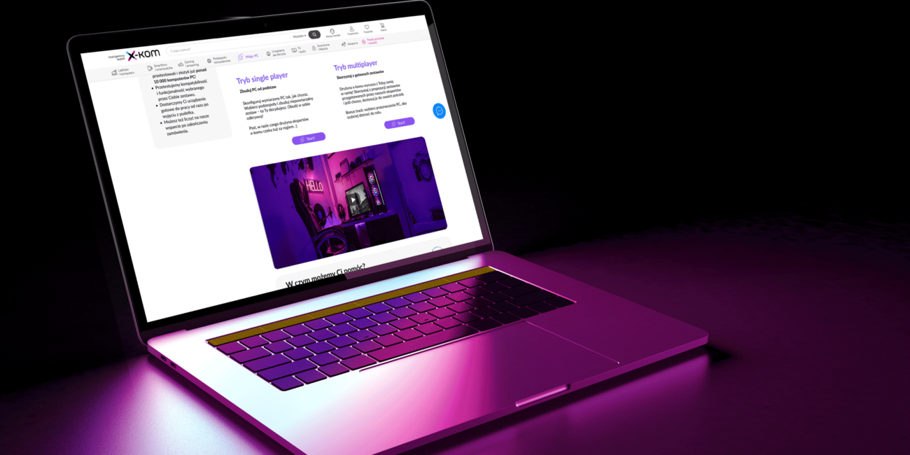
Mission: PC is a configurator tool for x-kom’s (Polish technology shop) clients.
Why “mission”? Well, building a PC can be a challenge, but this name has strong roots in my user research and storytelling process.
Project type: full-scope UX/UI student’s project
My role: UX, UI, prototyping, tone of voice, UX writing, documentation
Client: x-kom
Duration: October 2021–July 2022
Team: me + 3 other students
Challenge
Setting up the scene
Why do user configure PC?
Among different purposes, the most popular are gaming, professional use (ie. motion or graphic design), and general use.
According to research insights, people prefer to configure PC by themselves rather than buy a set to have something individual, and responding their exact needs. Sometimes– also to save some money.
Why is it so hard?
It is possible to configure and order PC with incompatible parts that will not work at all (or will not be efficient).
Knowledge about PCs is scattered; technology changes insanely fast, so it takes a lot of time to do proper research.
It is a complicated process with many dependencies and variables. Users have to revise their decisions many times.
X-kom has to verify every order and fix errors, which is time-consuming.
Business goals
Reduce the number of failed configurations.
Speed up the contact between x-kom and its clients.
Reduce the Contact Center’s overload.
Solution
Join the journey
Mission: PC will help clients who want to buy a customized PC, but sometimes don’t have extensive technical knowledge. The solution offers smooth and fast process – with expert support and features to prevent incompatibility.
It also aims to tame a technically complex topic with easy-to-understand language and provide ongoing advice.
Process
Here is how it was done
Research
desk research; 19 in-depth interviews; card sorting; story sharing; competitor analysis; current website analysis
Define
problem statement; 4 personas; 4 customer journey maps; Customer–Problem–Solution; Unique Value Proposition; client presentation
Ideate
brainstorming; object-oriented design; impact–effort matrix and Eisenhower matrix; sketches and wireframing based on user stories, user flows and user scenarios; moodboard, storytelling and copywriting; client presentation
Design
Figma interactive prototype for desktop mobile version… and iterations
Test and documentation
6 usability tests in 2 rounds; corrections to prototype; client presentation; preparing documentation and thesis defense
My role
I was involved in every project stage from the very beginning. I conducted 6 IDIs, and prepare much of the desk research.
For the UX strategy phase, I created a user journey map, most of the user stories, and the most complex user scenario. I analyzed all card sorting results.
I prepared and managed a moodboard with visual and tone of voice references.
I was fully responsible for the prototype of the desktop version, storytelling and preparation of design documentation.
Research
Mission preparation
User interviews
We conducted 14 IDIs with 2 main groups – novice and hard users. The question list included these topics:
- the configuration process
- sources of information
- motivations
- emotions during the process
- goals
- and more.
Each group brought us completely different insights and observations. The advanced users told us that the configuration is… nothing complicated. It is even a kind of fun, adventure. Since beginners had far more concerns, we decided to focus on their needs first.
“I don’t want to be an IT guy, I just want to play my games”
→ Beginners don’t buy a PC itself. They buy the usage of it.
“God, no, never again. I just want to finish it”
→ The process is overwhelming for beginners, research part seems to last forever.
“Please, choose it for me, and I will pay”
→ Beginners need a piece of advice, especially from someone they trust. They show a lot of uncertainty.
„I need an IKEA manual for this”
→ Scattered information and complicated terms are frustrating.
“It’s not like buying cheap shoes (…). So I will keep looking until I find one”
→There is pressure to choose well.
„With YouTube, everyone is an expert”
→ Technology is not their passion, they look for what they need.
The advanced users told us that the configuration is… nothing complicated. It is even a kind of fun, adventure.
Since beginners had far more concerns, we decided to focus on their needs first.
“It is 30 minutes of work. Nothing complicated”
→ Experienced users trust their skills and knowledge.
“I like to do good deals”
→ Looking for components is like hunting for the best prices.
“I appreciate that the store behaves appropriately for me”
→ They attach great value to customer service, especially speed of service.
Business perspective: interviews with employees
- PC configuration from their perspective
- the company’s internal processes
- verification stages
- contact with customers.
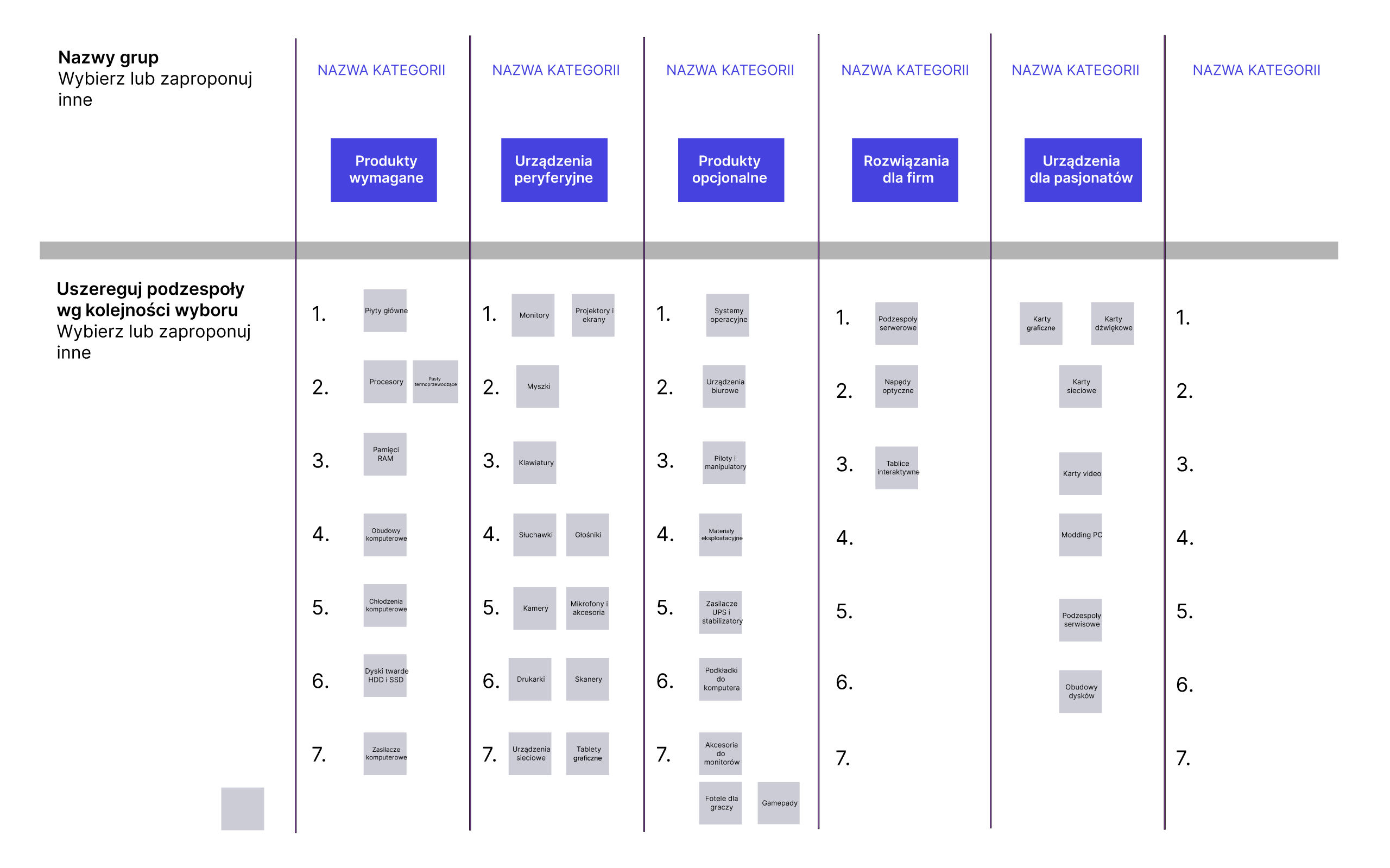
Card sorting
Card sorting during IDIs helped define some of the problems with component naming. I used this knowledge in UX writing part, offering explanations and clarifications.
The goal was also to check if there is a “correct” or most common order of component selection.
(Spoiler alert: No, there is not; this was confirmed by both x-kom staff and my analysis of the card sorting results).
Key insights from the research phase
From desk research and interviews
Budget is important, but no longer the main factor – due to broken supply chains during the COVID period, prices are constantly changing.
The x-kom website does not clearly state that acompany can build a computer; currently, users can do so by adding components to a shopping cart and ordering an assembly service.
Advanced users advise beginners. They share configuration knowledge (for free or not) via social media.
From competitve analysis and interviews
Competitive advantage 01: x-kom has a group of great experts dedicated to their work who are willing to share their knowledge.
Competitive advantage 02: x-kom not only cares about PC compatibility but also about performance.
Defining and ideation
Mission plan
To streamline all the insights from the research phase, we created 4 personas and prepared a customer journey map for each of them.
This helped us better understand the steps and identify the main pain points – in the case of less advanced users mainly related to uncertainty and a strong need for confirmation, and in the case of more advanced and expert users related to constant changes in the market and missing information.

Kasia, 26 years old
Marketing specialist and gamer. Active in social media, laid back. Has no configuration experience and has poor PC knowledge.
Goal: set up a good computer as cheaply and quickly as possible
Needs: good quality at a good price; smart advice; a computer configured exactly to her needs
Concerns: slippery advice on the Internet; chaos/lack of information; prices too high

Maurycy, 35 years old
Freelance photographer who needs the best PC for photo and video editing. A gadgeteer and design enthusiast.
Goal: save time and purchase a state-of-the-art computer
Needs: fast process; aesthetic form; quality more important than price
Concerns: lack of an intuitive tool; chaotic information; long research; failures in assembly

Krzysiek, 23 years old
Computer science student and online gamer. A homebody who enjoys tuning his computer and advising others on PC configuration. Confident in his knowledge.
Goal: have a reputation as a PC expert; have the best computer
Needs: find components in the best prices; impress others; good quality
Concerns: advertising articles, incompetence of employees, missing out on good deals
Wojtek, 35 years old
Technical employee in x-kom verifying PC configurations and orders. Football lover, gamer, geek. Empathic and helpful.
Goal: help customers to buy the best PC as quickly as possible
Needs: knowledge sharing; better contact; more questions from customers at the beginning to avoid latrer problems later
Concerns: process inefficiency; fast technology changes
Prioritization
Each persona (and each target group) had a series of problems to solve. To decide what the top priorities were, we created about 80 user stories, aggregated them into larger epics, and prioritized them using an impact and effort scale and an Eisenhower matrix.
Urgent
Not urgent
Important
As a customer, I want to have all my PC configuration information in one place to avoid searching in multiple sources.
As a customer, I want to see only products that are compatible with my choices to build the correct PC set up.
As a customer, I want to be able to modify the presets to speed up the process.
As a customer, I want to easily contact an expert to check my choices and avoid configuration errors.
As a customer, I want to use existing configurations (created by other users) to speed up the process.
Not important
As a client I would like to exchange information about PCs with other users to share my opinions.
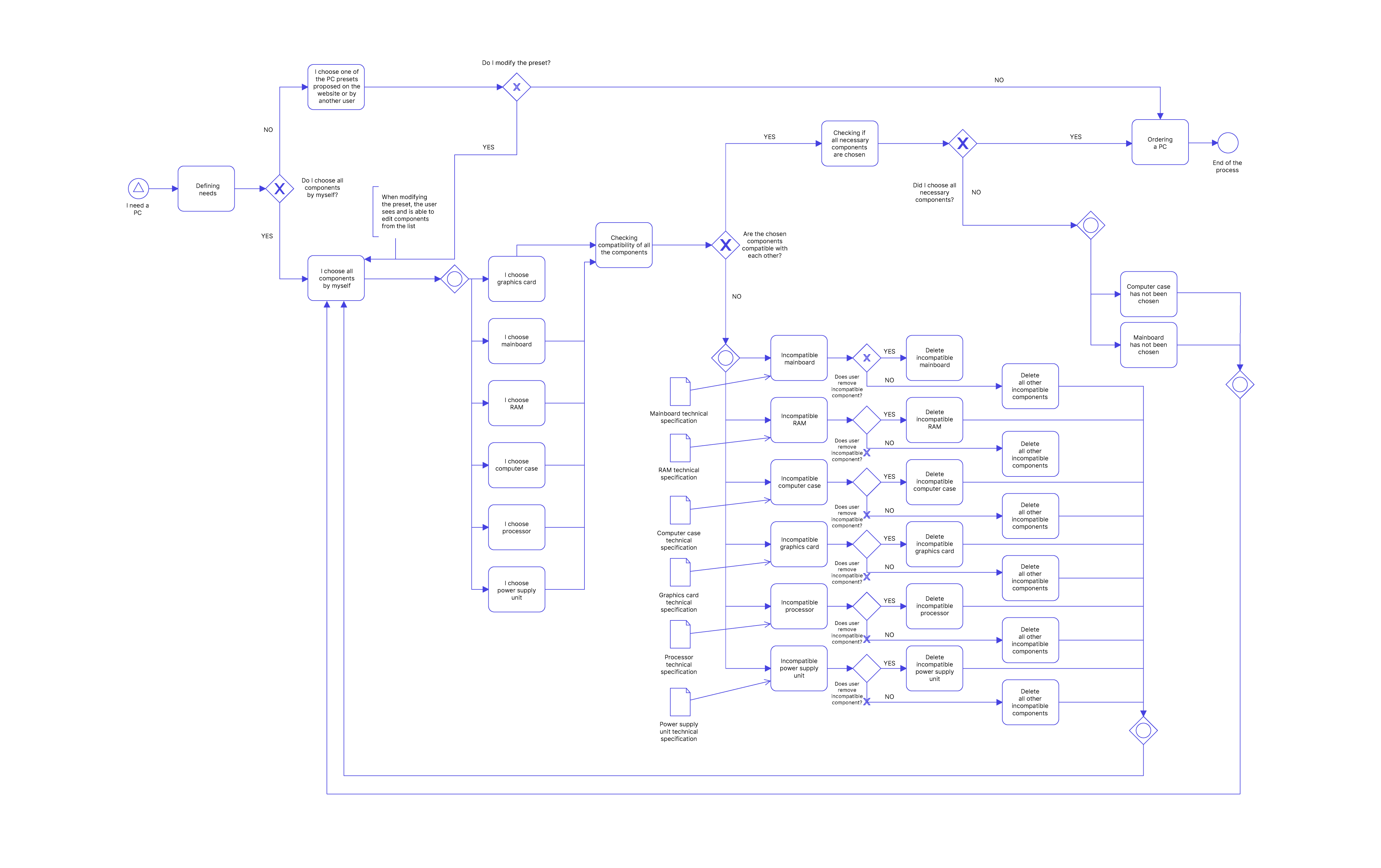
User flows
Below is a simplified example of the flow in our product, showing the process of selecting only basic PC components. We build some of these to understand the internal mechanics of the configuration process.
So, how we would like to solve the problems?
Problem
Solution
01
Compatibility filters.
02
Configuration summarized in one simplified view.
03
Information is chaotic and scattered.
Tips and knowledge in a nutshell helping to make a right choice.
04
Lightened up and assimilable language.
05
Highlighted information about the service and clear rules.
06
X-kom technical employees and Contact Center have to fix many orders, which takes time.
Better safe than sorry: more options to advise the client before he/she makes a choice.
Sketches
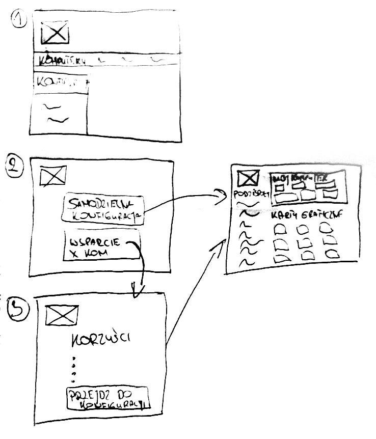
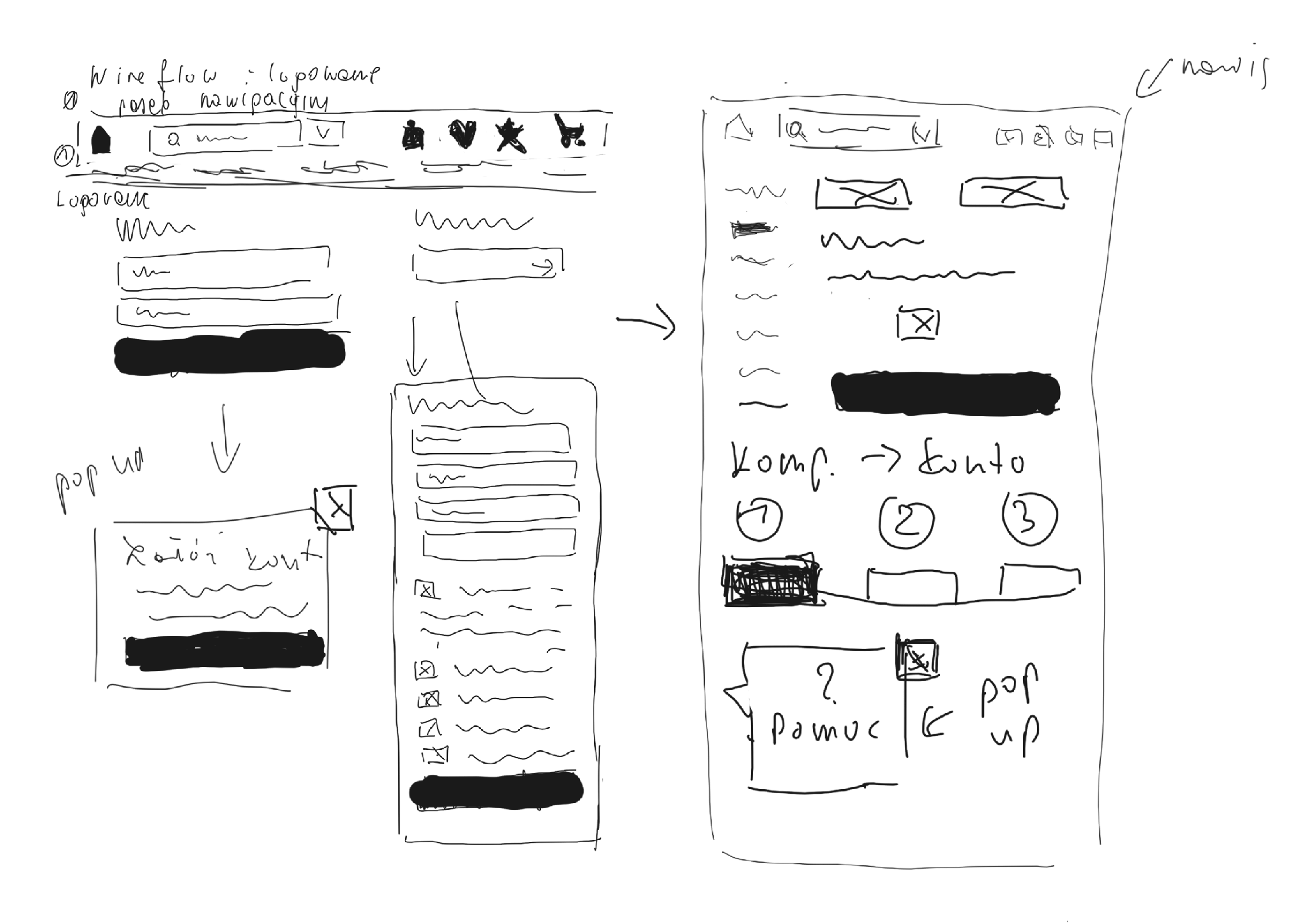
Metaphors: space for storytelling
An interesting research observation for me was that both novices and experts, and also x-kom employees, used almost the same metaphors to describe the process. They compared it to Lego, the anatomy of the human body, or a puzzle.
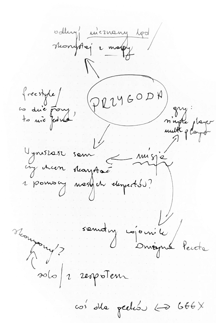
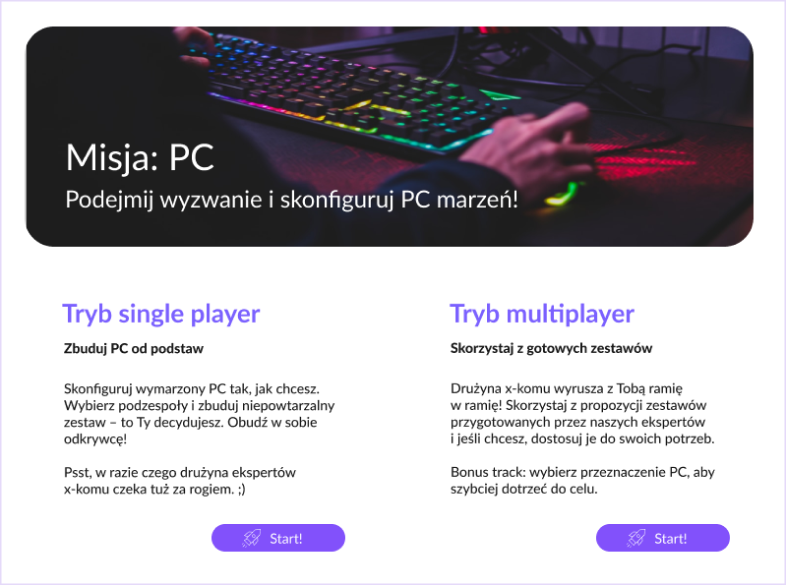
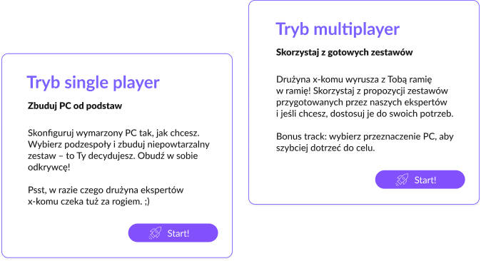
If users want to play a game, why shouldn’t we offer them one? I created amap of associations that led me to the final idea for Mission: PC as the tool’s name. “Single-player mode” and “Multiplayer mode” are path names that relate to the gaming world.
Many of our users are gamers, and it is also consistent with the company’s tone of voice and business goals.
My role
At this point, I could make the best use of my editorial experience. A review of the thesis defence proves the value of this approach: “Special applause for the copywriting, leading the user, but – thanks to a sense of humor and distance – not too intrusive.”
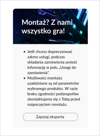
Design
Building a rocket
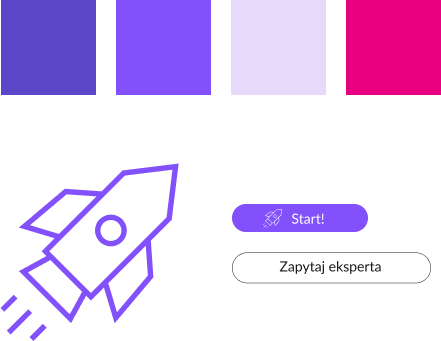
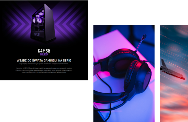
Visual style
Simplified or advanced path
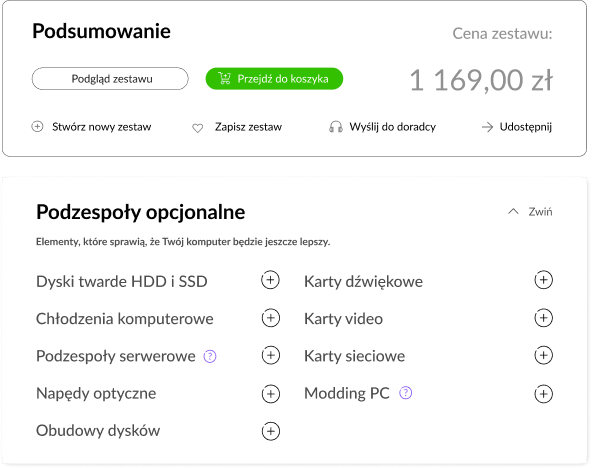
Clear configuration preview
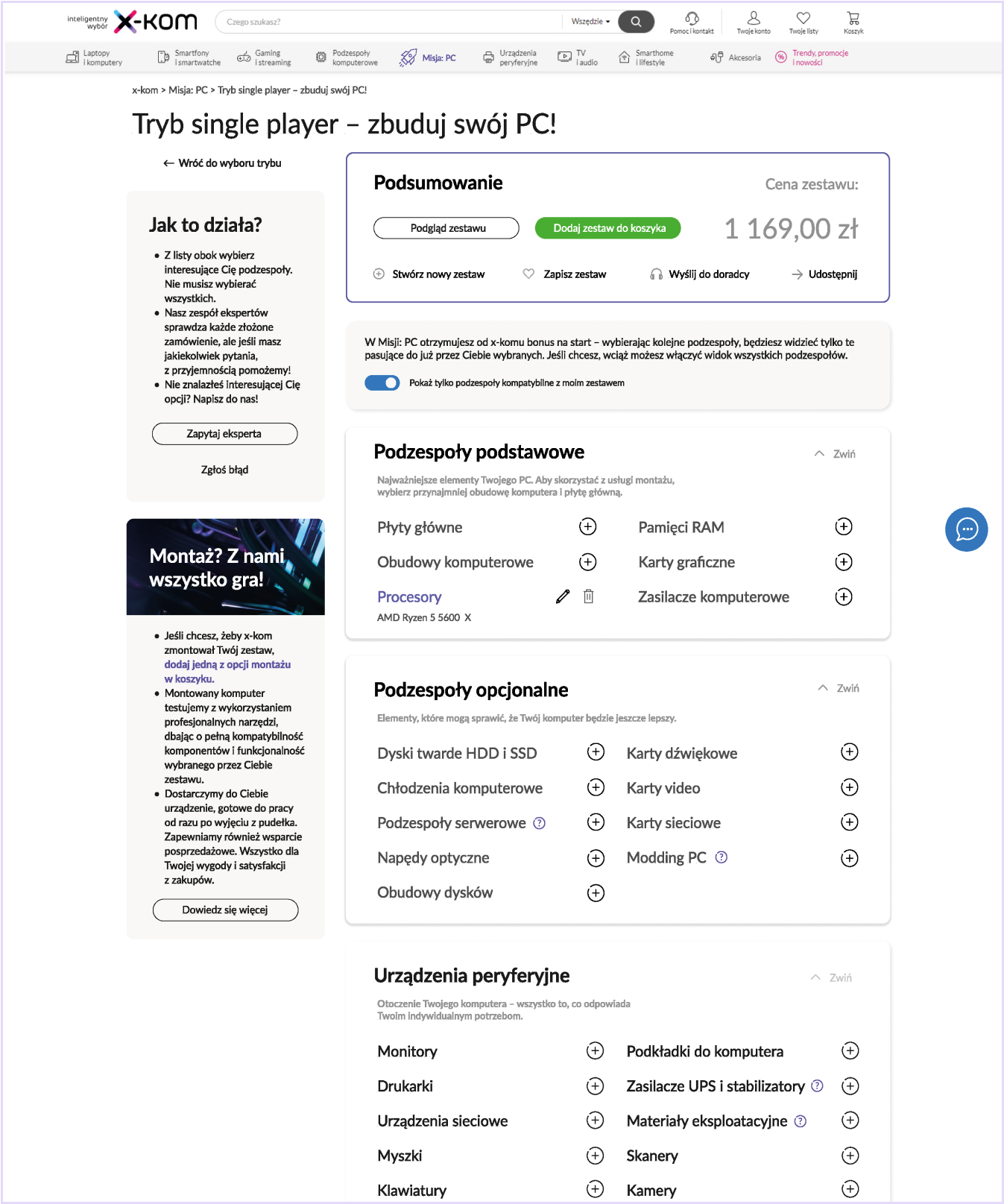
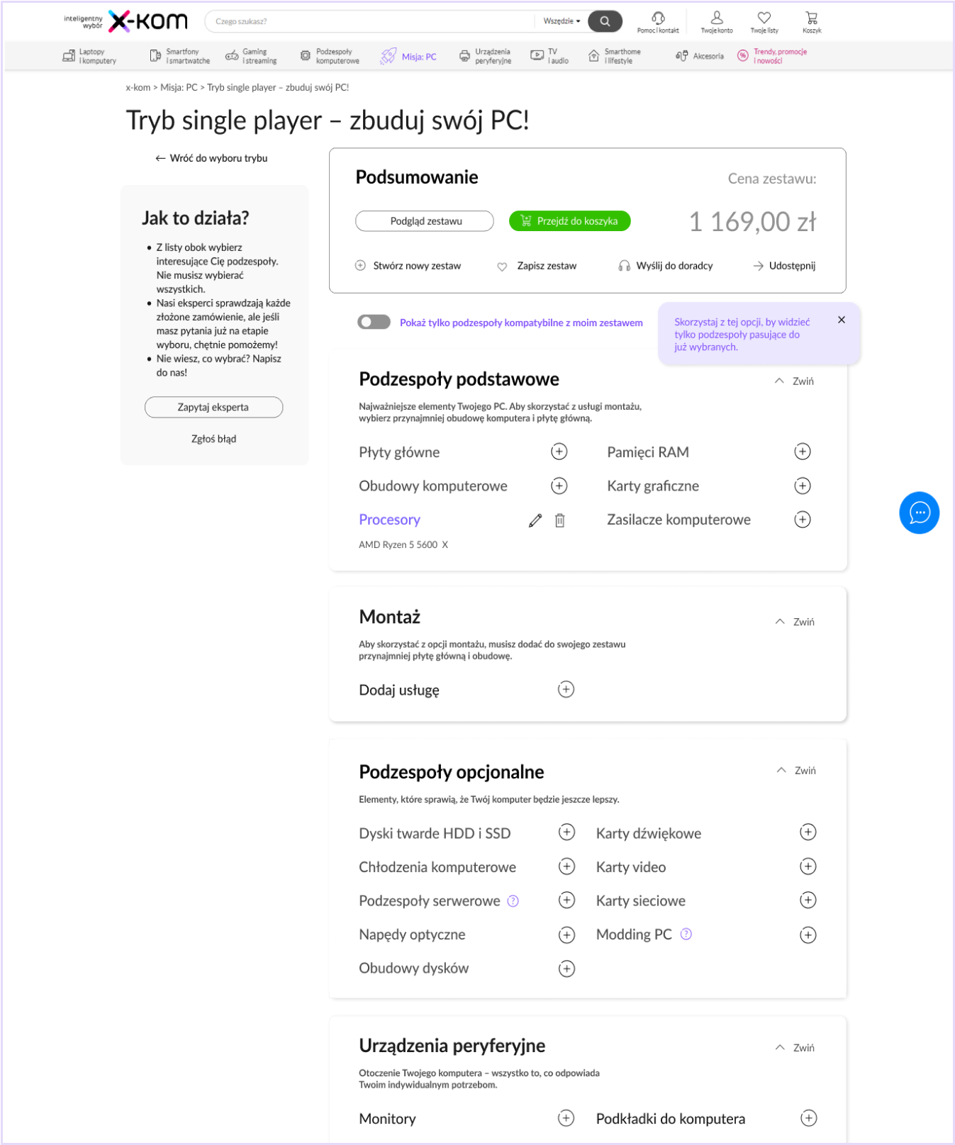
The main view consists of 3 main categories (basic, additional and peripheral components).
Mysterious or obscure names (recognized in card sorting and IDIs) have brief explanations that activate when you hover over them. They also appear on product pages.
Summary
Placed at the top, it updates continuously as each successive component is selected. The user sees the current price, a preview of the kit, “share” and “ask an expert” option – a remedy for uncertainty.
Solving compatibility issues
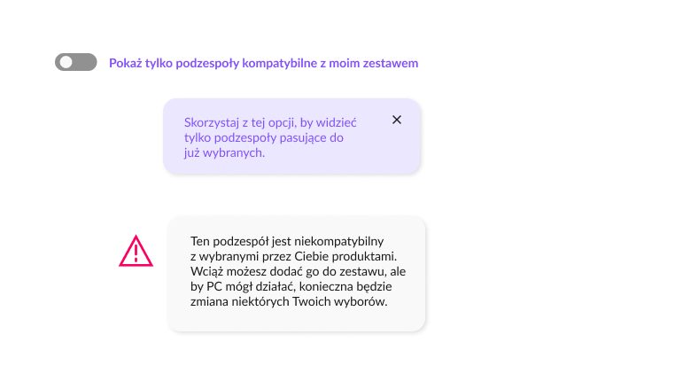
A compatibility filter based on machine learning allows to disablle all components that do not match the user’s previous choices. It is also available for each product category.
A triangular warning sign next to an incompatible component acts as a double-check when the filter is disabled. When a user adds a component despite the warning, he/she will see an alert informing him/her of the necessary changes.
Additional assembly service
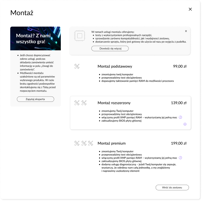
It is possible to add an assembly service to the PC set. Since the user was not aware of this, we highlighted this option in the main view. There is a technical limitation: the PC set should include at least a computer case and mainboard. We designed several alerts to remind users of this fact.
It is also possible to add an assembly service at the end of the path, in the shopping cart.
Tips
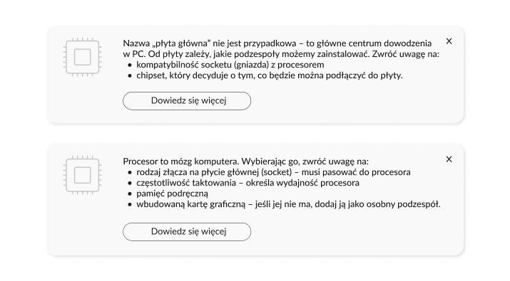
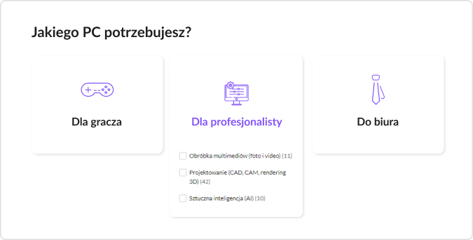
Categorized presets
To prevent discretionary user decisions, we have added an option to edit presets in multiplayer mode. The editing method is the same as for the configuration from scratch.
When it is not possible to change a component, it becomes gray (and the user will see an explanation when hovering the cursor).
Expert's support
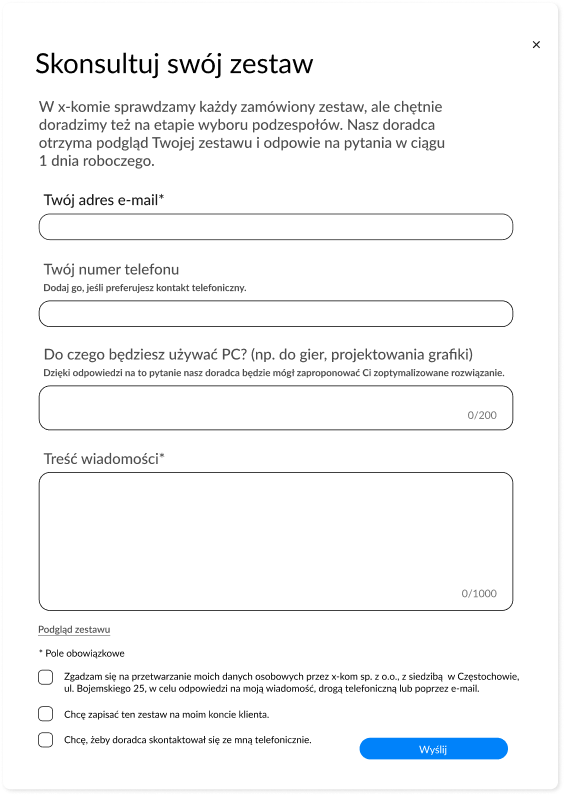
Verification need has visibly revealed during the research phase – so there is an opportunity to contact an expert on each screen.
A dedicated form allows the user to specify needs and ask direct questions.
Why not “mobile first”?
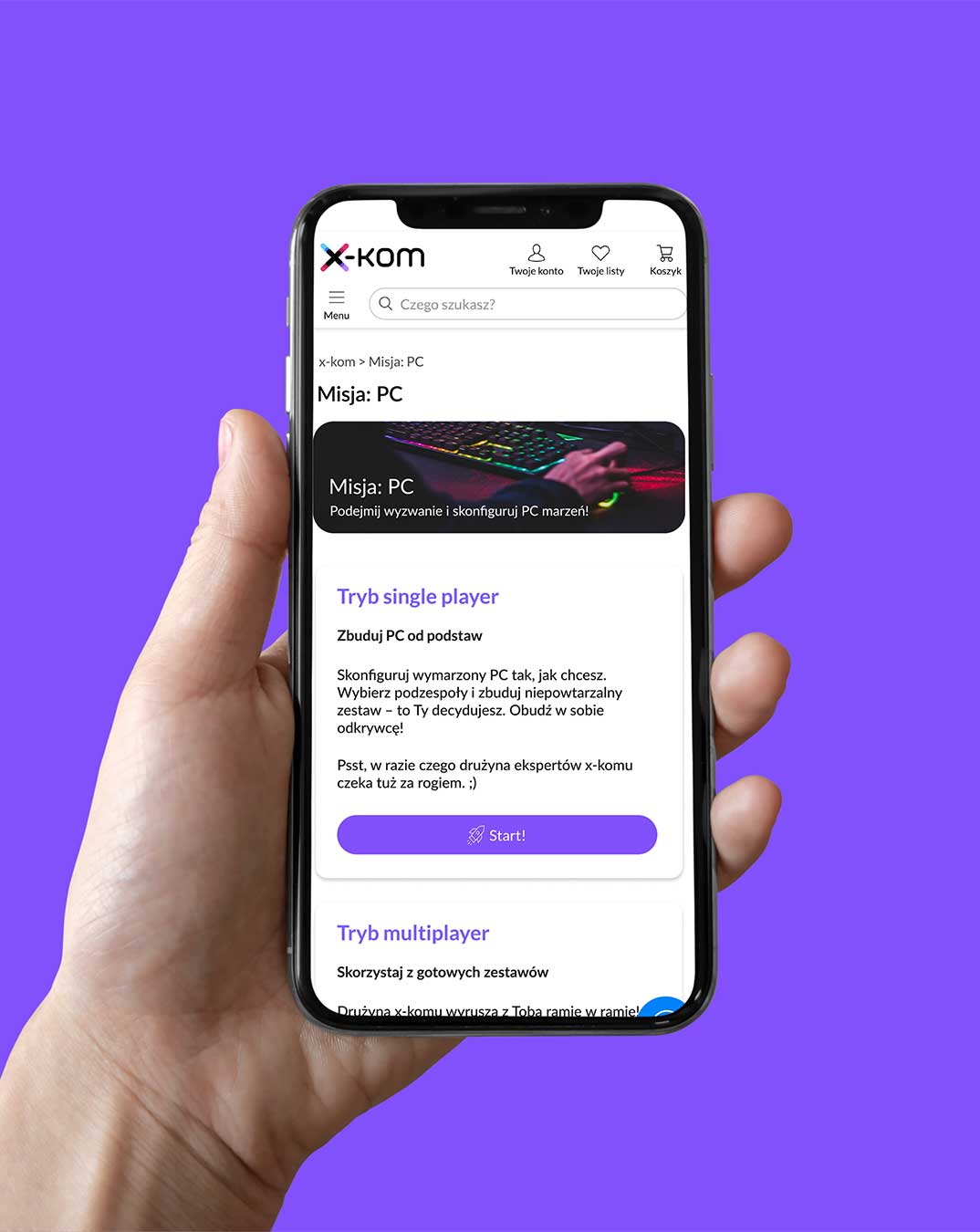
We decided to create a desktop subpage – almost all interviewees indicated a desktop as their main tool during configuration or research.
A smaller screen is not as convenient for checking lengthy technical specifications – but we also designed a simple mobile version.

Test
Who wants to hit the road?
Challenges, pitfalls...
Problem
Solution
01
Additional assembly service. Originally placed as a side banner, it was difficult to see and considered an advertisement.
We moved it to the components list, which was way more effective, as the second test round proved.
02
Compatibility filter. Originally it was active by default and not very visible.
We added it to the entire set and each category. What is more, if the user wants to disable the filter, he/she will still see the warning triangular icon next to the incompatible component – as a safety valve.
03
Texts. Although users found them clear and entertaining, they were too long to read.
I rewrote some of them and simplified them wherever possible.
...and little successes
Here are some opinions from the testing phase about the proposed solution.
Mission: PC “sounds like something exciting”. The rocket "reminds you of the mission".
Explanations and tips are “unintrusive but sufficient, so you do not have to look for them”.
An option to send a configuration to an expert “hit the bull’s-eye”.
The visual leitmotiv – the purple color and rocket icon – is recognizable and eye-catching, “I know what to follow”.
Reflection
Sky is the limit?
Before the MVP was determined, the vision for the solution was much broader. It could be extended into more areas than just a tool on a website – to consulting, contacting experts, building a knowledge base, using social media, etc. As a result, we would create a comprehensive customer experience.
But one of my most important takeaways from this project was that done is better than perfect, especially in limited time.
What have I learned?
To be flexible
E-commerce is constantly changing and improving, so we had to come up with new ideas to respond to that.
To take a twin-track approach
It was definitely beneficial to think about users, but also about the company’s employees and business goals.
To stay open-minded and trust the data
And to not stick to the first solution that comes up during the process.
To sketch when I’m not sure
I used to do this before, but in this project I definitely practiced sketching iteratively.
To think big, but stay realistic
And to define the project’s MVP carefully.
To make use of my interdisciplinarity
For me, this project was proof that there is enough room in the interdisciplinary field of UX to use a variety of skills in a new context. In my case, it was both editorial and graphic design experience.
